AgingOptions - Website Redesign
2024
AgingOptions is a company based in the greater Seattle, Washington area that assists individuals in the 55+ age group in their life planning.
Project Overview
The Problem:
AgingOptions needed a dynamic website refresh. Combining familiar elements from their previous website with more modern interface, we were able to better connect their product to a wider audience.
The Goal:
Reorganize and redesign existing frameworks into a visually appealing website with enhanced user experience.
Role:
Project Lead
Responsibilities
Ideation & design thinking
User research
Competitive research
Site maps
Low-fidelity prototypes
UI Design
Project Context
AgingOptions is a life-planning service centered around Elder Law attorney Rajiv Nagaich. In addition to his practice, Rajiv has a long-standing radio show, PBS show, seminars, and instructional materials to help his clients plan for all the unexpected events that occur as we age. Their current user is in the 55+ age range, primarily living along the West Coast of the United States.
Research & Planning
Initial Steps
During early consult calls with the client’s team (Marketing Manager and lead Content Writer) we discussed the scope of the project and their vision for AgingOptions. My key suggestions during this time included creation of a site map for the existing website before the reorganization, competitive analysis, user personas, and a content inventory.
Site Map
It became clear that this industry is highly informational, with many competitors organizing a wealth of resources in different ways.
The current website had many pages and landing pages that needed to be organized and presented differently.
Because of this, I found it necessary to map the existing website and then propose changes afterward. Two site maps were created and used to create the new page designs.
User Personas
Two user personas were defined:
Golden Years Planner: Fears losing independence most of all and worries about their children having to pay hefty medical bills should they fall ill. Retired, they wish to find ways to better manage their assets to supplement a pension and/or Social Security. Sophisticated tech isn’t accessible to them, so they prefer simple interface, and in-person events or books to further engage.
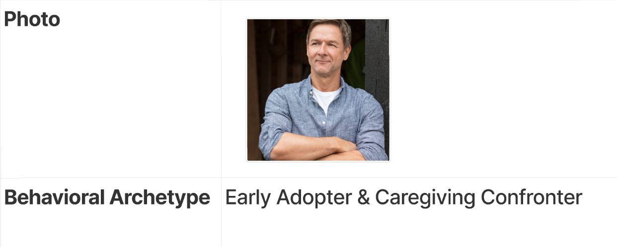
Early Adopter & Caregiving Confronter: In middle age, they have planned for retirement and assisted their aging loved ones with the logistics of medical care. They are eager to avoid the same pitfalls, create a more comprehensive plan for their golden years, and enjoy the life they have saved for.
Competitive Analysis
Life-coaching and retirement planning service providers offer similar products and valuable points of comparison. Many of these competitors also have a bulk of information that needs to be streamlined and communicated in a clear way to direct users to the right product. The first two competitors were named by the client, but the remaining three were uncovered through independent research and industry knowledge.
Competitors:
Heuristic Evaluation + Feature Prioritization
Analysis of the original site identified possible problems with user experience and completion of their journey. These were categorized in an evaluation diagram ranked by severity.
Upon comparing its current features against those of competitors, these elements were determined to be needed on the new website:
Free resources and calculators
“As seen on” for products
Show information and schedule for prospective viewers
Notification banner for promos to generate additional sales
Google business + reviews (footer) to add credibility
Our Opportunity:
Create a website, simple in design, that enables users of an older generation to navigate with ease, find resources, and purchase products. It should be modern, but accessible, inviting in an audience of younger users, and facilitate engagement with other brand facets, including a radio show, podcast, live events, and social media.
Client’s Vision
It was important to preserve the existing brand identity while elevating the experience for potential clients visiting the website
During the discovery call we refined the audience, discussed desired website look and feel, and created a plan and timeline.
Research was essential in understanding the audience. Hours were devoted to researching the industry of financial & retirement planning, identifying desirable features on competitor websites, and deciding on small changes that could be made to the brand to complement a modern look and feel.
After that, the design process began.
Initial Design
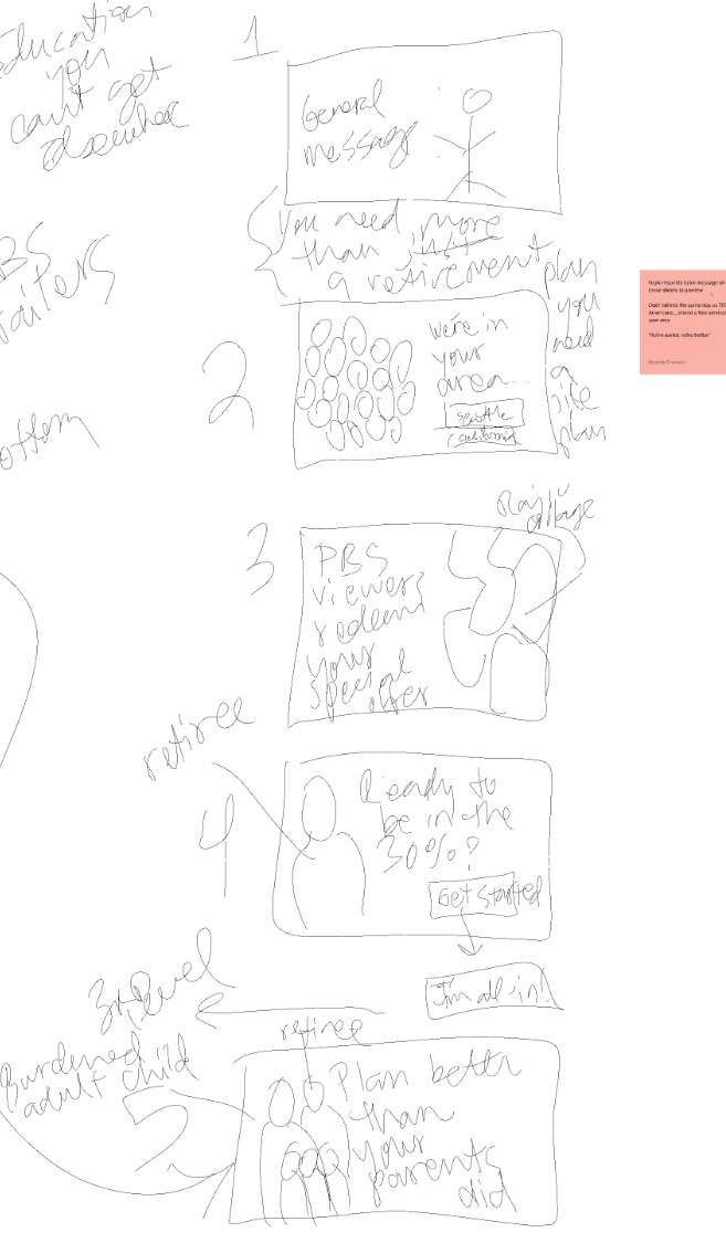
Sketching, low-fidelity prototypes, and use of a CRM page editor were used to translate ideas for changes into visuals for the client to review and offer feedback.
Sketching + Brand Embellishment
Sketching was a heavily used tool in calls between myself and the client. These sketches were used in place of wireframes and the sketches occurred in real time, for client’s feedback on layout and major features, such as the navigation header.
I sketched while sharing my screen to show them how their ideas could be conceptualized.
It became clear that brand embellishments would be necessary to create a beautiful design, similar to other modern planning websites.
I created patterns and texture packs, implemented extended use of a minimalized logo, and adapted the color scheme to the new design.
For example, instead of focusing on the overbearing red color, I suggested a more neutral gray to enhance the golden hue with red used as an accent.
From sketches to low-fi prototype
Client Feedback
Due to the accelerated timeline, I invited the client for a remote review of these items:
The header & footer
Home page layout
New UI elements
Adapted fonts
Site map
Because we were not using wireframes, I used this time to collect feedback and implement their requests over the entire site.
Design Work + Styles
Use of Photoshop and Canva were needed to make changes to existing brand images to enhance their composition for use on a website.
This photo of Rajiv and a host removed text on part of the image that was distracting behind a button overlay
This collage was created using photos of Rajiv speaking for the hero image slideshow
Shadow styles, texture use, and pattern styles were created to add dimension to the design.
Components
Many UI elements were already created and in-use by the developers, so I tried to work within these constraints as much as possible. I focused on layout design and minute updates to bring the redesign to cohesion.
These items were created:
Cards
Dividers
Icons
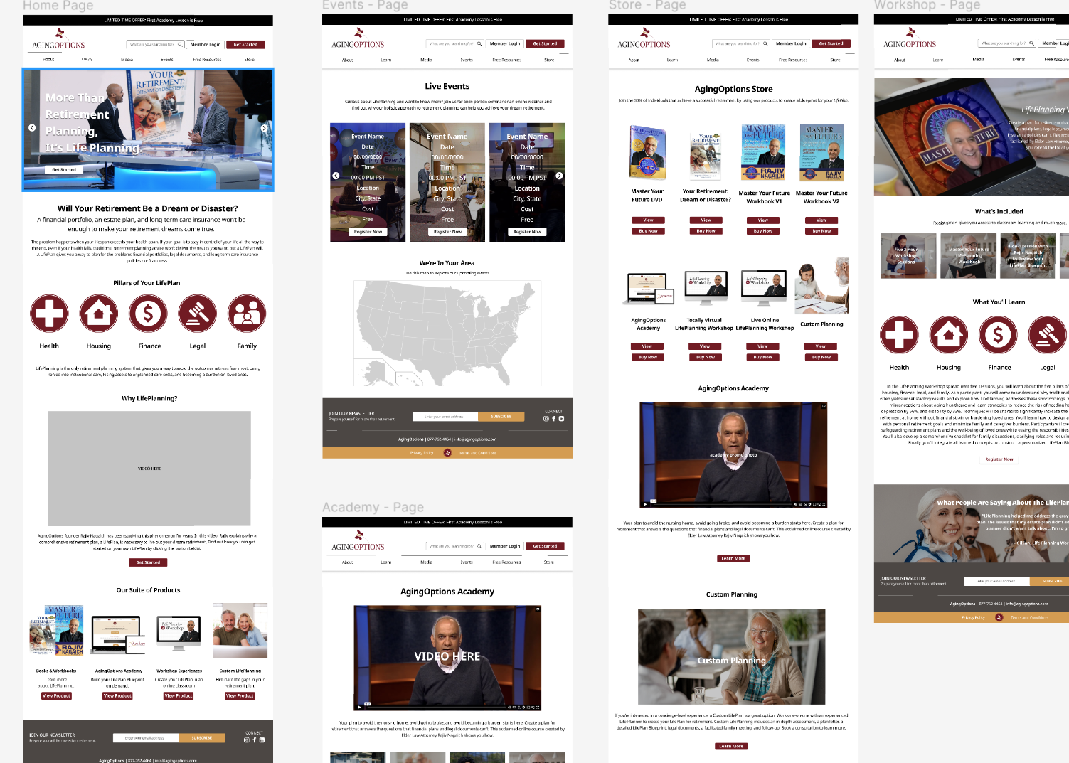
Low-fidelity prototype
Next Steps…
After the suite of low-fidelity pages were created, the project was handed off to the Marketing Manager and over to the development team for completion.
In Conclusion
|
In Conclusion |
Conclusion
Things I learned from this project:
Testing and research should take as much time, if not longer, than the design phase.
When communicating across teams it’s sometimes easier to “show” and not tell, using whiteboards or sketching tools while on a video call.
Developers need clear instructions in the form of high-fidelity prototypes, even when UI has been developed by the same team previously.
Other design skills will enhance your final design. Photoshop, InDesign, Illustrator, video editing, and more will add polish to your designs.
This aspect was gratifying, knowing that my previous design skills will help my clients stand out or make me attractive as a collaborator.
Oftentimes the client won’t know the solution, but previous experience in brand strategy and design equip you to anticipate their needs and make recommendations they wouldn’t think of themselves.
This was a fun, fast-paced project that allowed me to step into my authority as a product designer while highlighting areas where my knowledge could be improved.


