MatchChat - Case Study
2023
MatchChat was created as part of the
University of Washington Professional & Continuing Education
UX & Visual Interface Design Certificate Program
Project Overview
The Problem:
Society has becoming increasingly polarized. It's natural for people with similar interests and beliefs to gravitate toward one another. Unfortunately, without diverse perspectives and experiences, we can become blind to the stories and perspectives surrounding us.
The Goal:
How might we help people better understand our diverse perspectives and strengthen our desire for supportive and equitable relationships? How can we utilize technology and design thinking to address this need?
Role:
User Research
UX Design
UI Design
Responsibilities
Ideation
Usability interviews
User flows
Site maps
Paper and digital wireframes
Mid-fidelity prototypes
High-fidelity prototypes
UI Design
Research & Planning
Initial Steps
We were placed into groups based on our chosen problem statement. We collaborated on all aspects during the research and planning phase.
Together we conducted user interviews, created a comparative analysis, created personas and journey maps, conducted an ideation session, created concepts and tested them.
Other Group Members: Tai, Tatiana, Celine.
User Interviews
Participants were selected among friends, family, and peers. Each researcher on the team interviewed four participants.
60 Minute Interview
Questions sought to further refine the problem statement and assist in creation of user personas
Interviews recorded and transcribed
Interview transcripts analyzed
User Personas
After much deliberation, two user personas were defined:
The Lurker: Interested and engaged in current events, but less likely to participate in an observable way that would create direct conflict. They have a desire to learn about others and seek out others’ perspectives, but do their own research on any topic before drawing a conclusion about how they feel. They want to feel engaged with the world and see a sense of fairness.
Agent of Change: Seeker of justice, knowledge, and commonality. They tend to be higher-educated and well-traveled. The Agent of Change is an active participant or a driver in “Breaking the Bias Barrier” and ultimately want to encourage safe and open discussions.
Our Opportunity:
Most people seek interactions with diverse viewpoints, but require a suitable platform to connect, engage in meaningful conversations, and build the capacity for future constructive dialogues. It's crucial to cultivate a safe environment where individuals feel included and can amplify their voices within a receptive community.
Journey Map
After creating the personas, we created a journey map.
This accomplished the following:
Assessed the differences in the journeys between the “Lurker” and “Agent of Change” personas
Analyzed their psychological experience after encountering a perspective different to their own, and the resulting actions
Competitive Analysis & Ideation Workshop
Each team member researched potential competitor products and shared analysis
During the ideation workshop, group facilitators presented the problem statement, executive summary, and assigned persona & user journey to the participant group. Competitive analysis examples were provided to participants and they were introduced to the ideation board.
Ideas were then clustered into main ideas or possible features, including building community, peer to peer, encouragement, etc. These main ideas were translated to values statements cards.
Initial Design
During the design phase of this project, more independent work was introduced, but the group remained integral for testing and feedback. User flows and wireframes for our proposed design solutions were informed by the features and values uncovered during the research phase.
Storyboarding
As a group we created individual iterations for our proposed concept
“MicDrop” was my proposal. This Chrome Extension would enhance a user’s internet browser by augmenting the experience with chat overlay based on the content of their current webpage.
The storyboards created a clear flow for how an user might interact with this extension
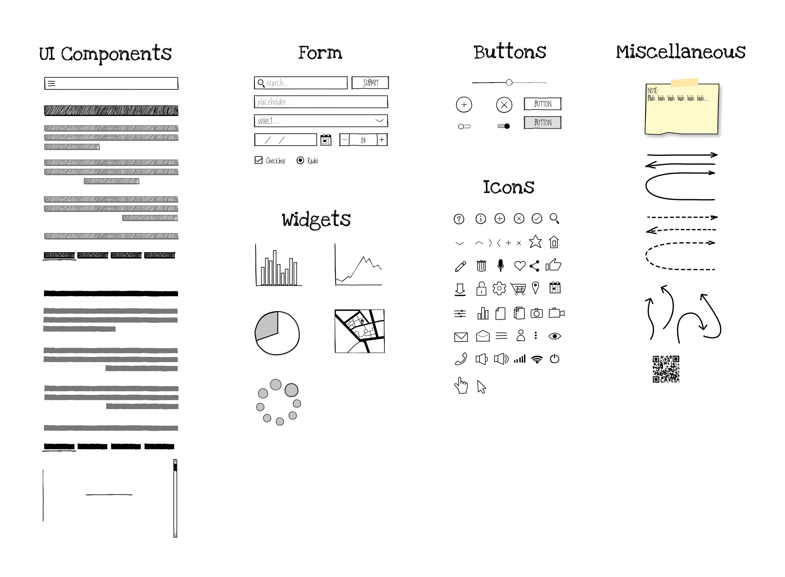
Lo-Fi Wireframes
Low-fidelity wireframes were essential for the storyboarding process. Three key steps were illustrated and used in concept testing.
Concept Testing
Concept testing methodology was established as a group
Participants: 6 individuals within our greater cohort
What features were and were not helpful
Any suggested changes, additions, notes for a concept
If a concept was relevant in participant’s life
How a concept ties into the problem we are trying to solve
Following the concept test study, each participant completed a survey about the concepts to:
Evaluate the importance of key features
Rank features by preference
This is where our paths diverged for solely independent work
〰️
This is where our paths diverged for solely independent work 〰️
Results
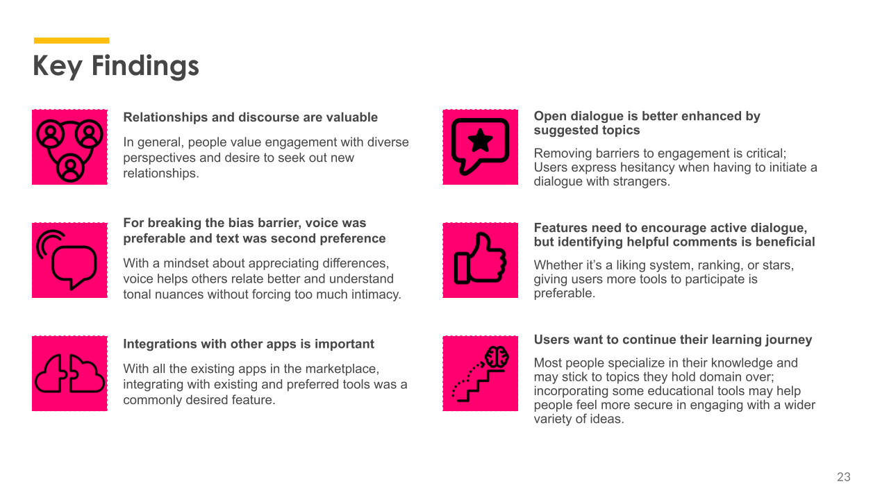
Out of four concepts, we determined a combination of “OurView” and “GetTogether” would be the minimal viable product
MicDrop had this feedback:
“Likes how it opens up space to chat freely and interact but also has limitations when things get heated”
“In our world, it's good to have the chat and word cloud visual.”
“If your focus or interest is not the same, how would the extension pick up on it?”
Design Theory & Prototyping
During the applied design section of the course, we moved forward individually with our chosen concept— existing or entirely new, rooted in the findings of our testing
My new concept, “MatchChat” combined a number of user’s most desired features from among the four concepts tested.
From wireframe to early protoype
Design Elements
Initial ideation included sketching and a mood board
The mood board emphasized these elements:
The energetic flux of the desert landscape— at times exciting and filled with energy, serene at others— to mimic the natural flow of conversation
Gradient colors, especially for icon illustrations
Rounded buttons and high amounts of negative space for a minimalistic feel
These elements encapsulated the idea of a matchstick, where at any moment a simple spark can ignite passionate discourse
Style Guide
Key elements for the prototype were chosen and then saved in a “style guide” frame. The color palette, shadow styles, typeface, and buttons emphasized the brand identity, while maintaining high levels of accessibility.
Components
Components were designed and saved in a frame for the upcoming redesign of the early prototype
Cards
Buttons in different states to simulate action by the user
Keyboard layout
Dialogue
Navigation
Icons
Dividers
High-fidelity prototype
Final Usability Testing
During the final testing phase, classmates were asked to complete key user flows and provide feedback based on prompts.
Key feedback:
Some design features needed higher visibility, line stroke
Majority of user flows were successful, with a few kinks that needed addressing
Prototype could benefit from higher sophistication in the design, extended amount of frames in the flows
In Conclusion
|
In Conclusion |
Conclusion
There are a myriad of things I would do differently after completing this project.
These include:
In-person user testing
Participant pool more closely aligned with the personas
Expanded prototype with comprehensive user flows
Art directed photography to supplement design
More cohesive color theory
Custom illustrations
Overall, the project would have benefitted from a longer research phase. However, I am very pleased with my first formal UX project and will continue to refine my skills.


